BACKGROUND
REWE is one of top supermarket brands in Germany, nurturing trusted product quality.
’To Go’ is a young city focused shop system, focussing on the go products, that are healthy and without additives. The Brand is still searching for a strong identity to be competitive to other fresh driven shop systems.
Without touching the Brands Logo, my task in late 2016 was to create a creative strategy and guide my team and myself to create strong visual brand identities. Due to briefing changes, the pitch went into a second phase with new targets.
This is a small selection from phase one.
SOLUTION
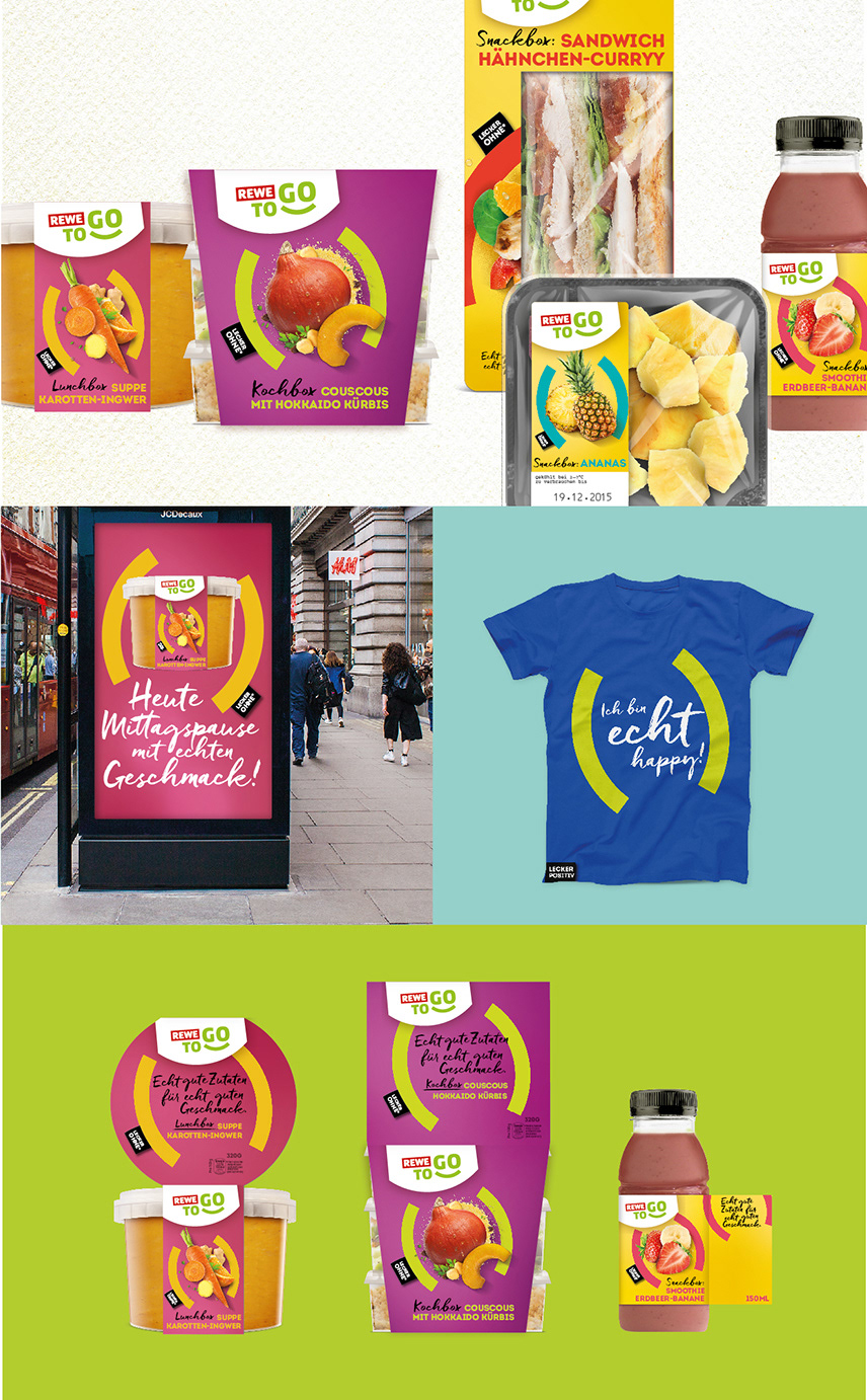
´New Snacks for your City´– this is what this concept nurturs. A passion for pure, fresh and quality driven food inspired from citys urbanity, individuality and european food trends.
This Concept displays an enjoyable quick and easy food solution that is modern but always with the best quality from Rewe.
This Concept displays an enjoyable quick and easy food solution that is modern but always with the best quality from Rewe.
Role: Concept, Lettering, Design / Design Lead & Direction | Agency: Solutions Packaging & Design GmbH
Concept 01 ´new snacks for the city´

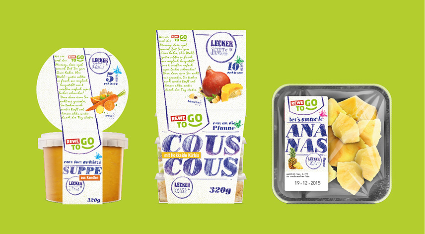
Concept 02 ´Food in Focus´
This concepts nurtures the concentrated goodness of the products.
By using the logos brackets, I created a strong keyvisual that nurtures the goodness of the products and creates an impact on shelf.
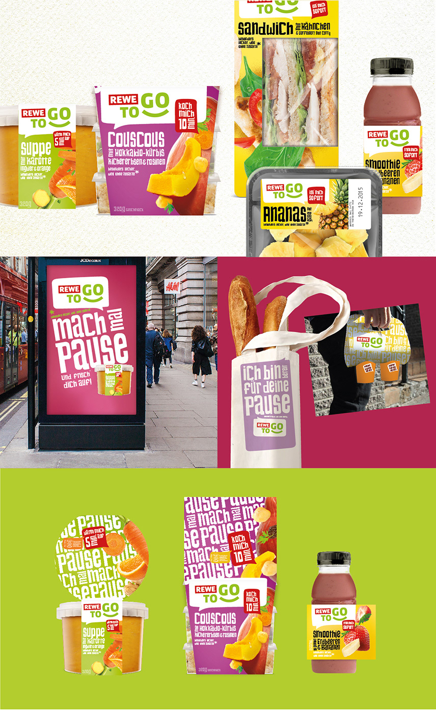
Concept 03 ´Make a break´
This concept nurtures the idea, that you can have a. better break with Rewe to go. Better because of the good quality products. Time is precious these days, so use it the best way you can.
The given logo, which is really approachable to customers, inspired me to create a design that uses this openness. Therefore I created this playful speech bubble umbrella brand. Together with the big and tasty food composing, the designs nurtures a contemporary look and feel. The pattern on top of some packagings is playing with the feeling of a picnic blanket, which is related with the concepts name.