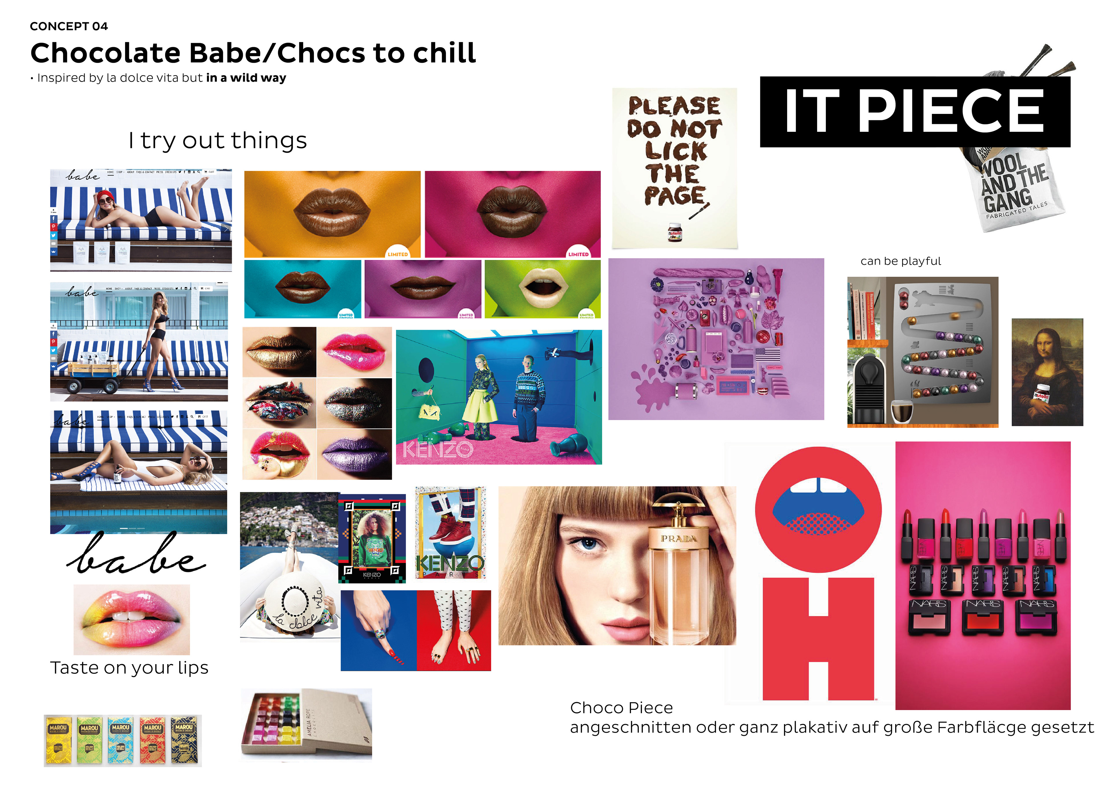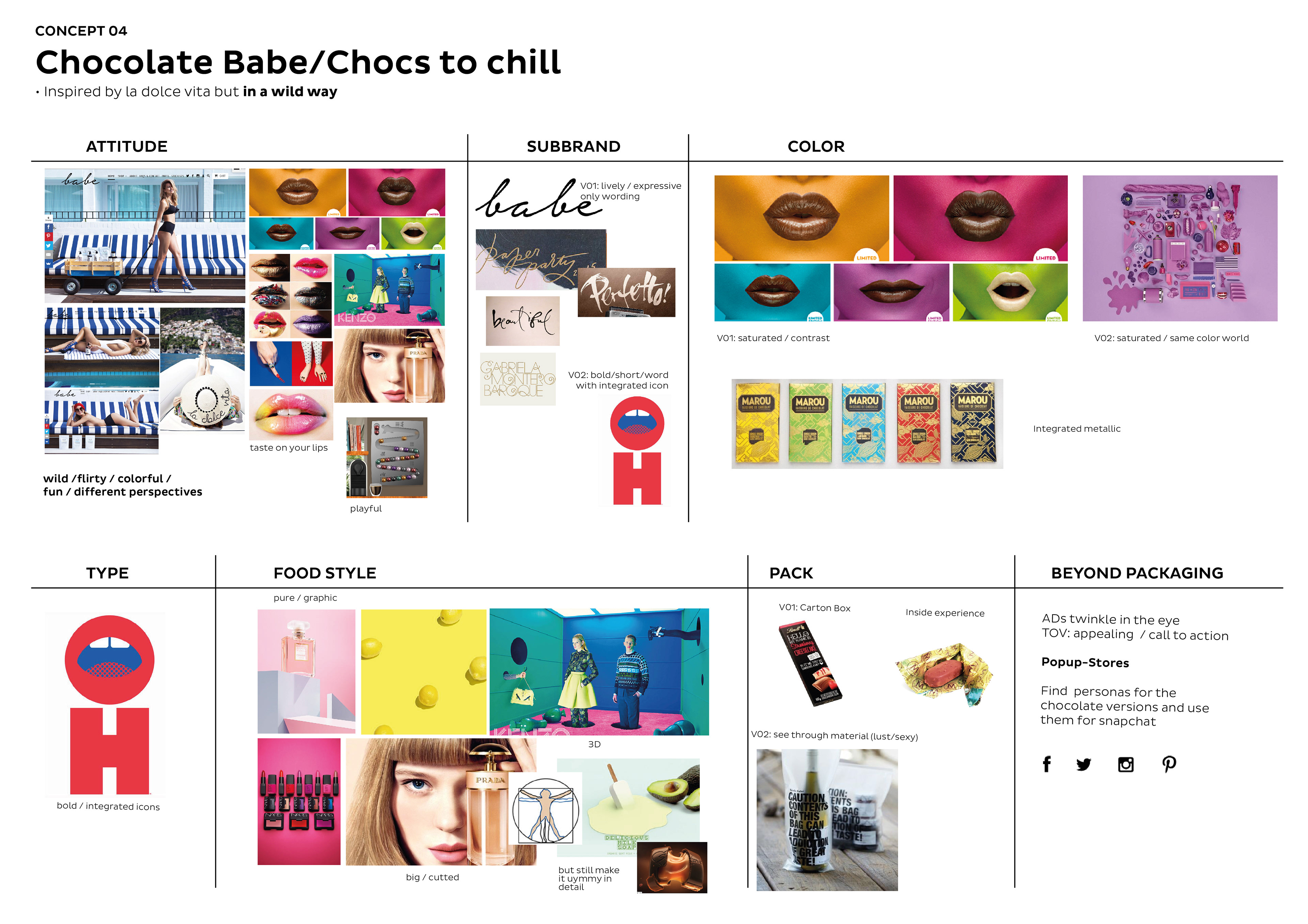
BACKGROUND
For a big Global Chocolate Brand I created several packaging design concepts, which should attract especially young millennials. The specialty of the used chocolate here is the unique core, which is layered with three different textures.
The Design Process included everything from pack form, naming to graphics.
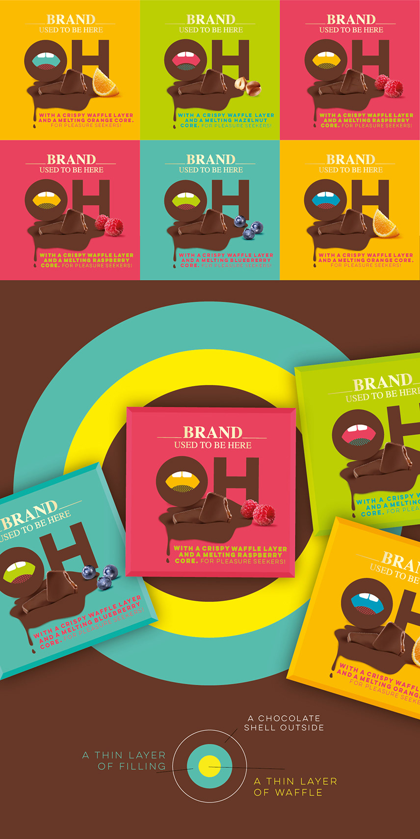
This is one Idea which still really like.
SOLUTION
I used the Circle and gave it a meaning…The "O" plays the relation to the core as well as it represents the "verbal sound" which comes while eating. I thought of this surprising moment when you bite into the chocolate and say "oooohhhhh".
For the visual language I decided to go into a modern graphic direction. For me, the design nurtures bravery, is a bit provocative, it´s tasty and unique and thereby invites the consumer to just try out this new chocolate.
Role: Freelance Concept & Design, Naming | Agency: Serviceplan Design, Hamburg
Concept/Ideas boards from my first ideas round