BACKGROUND
Vegavita is 13 years old private Austrian brand of REWE Austria that sells only vegan food.
In late 2014 vegan food packaging was barely attractive to consumers. But due to visible trends, change of behaviour in eating vegan and the more flexible usage, vegavita asked us to take part in their pitch to rejuvinate their branding as well as their packaging.
SOLUTION
With the new design I created an open, lively and overall more lifestyle driven design approach that attracts, besides vegans, also flexitarians and vegetarians. With the more iconic branding as well as with the new name “vegavita company“ I created a strong brand concept. The whole concept was outstanding in the whole austrian FMCG market at that time and leads to huge success and enlargement of Vegavitas portfolio.
Role: Creative Direction, Design Direction & Concept, Design | Agency: Lothar Böhm Associates
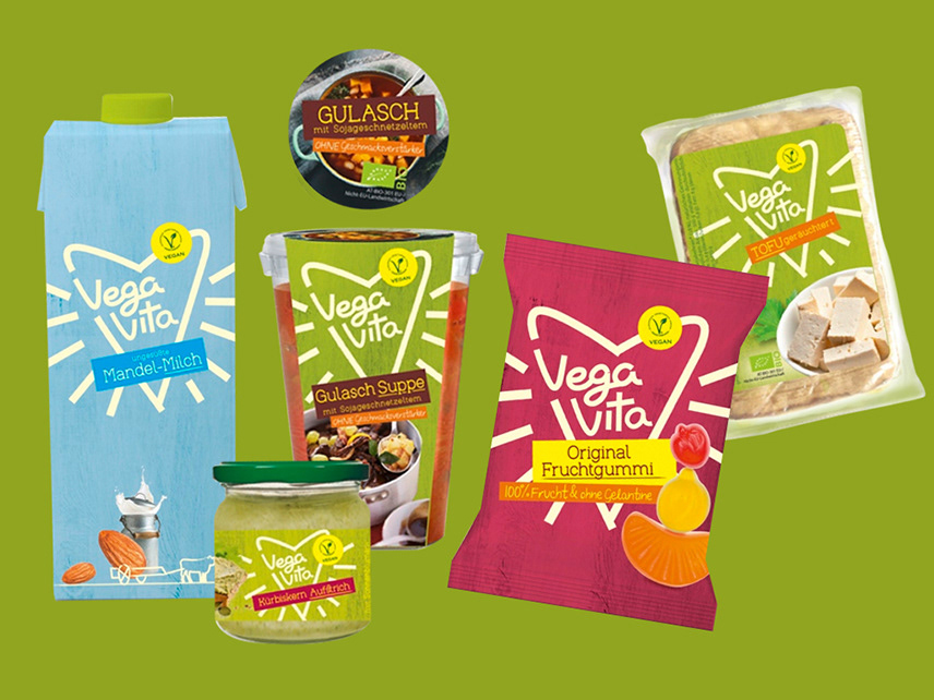
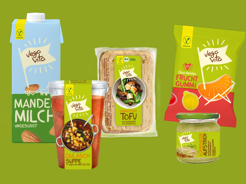
Final Packaging and Logo Design Picture reference: vegavita.at

Pitch winning design – Vegavita as a brand is the main focus here on pack.
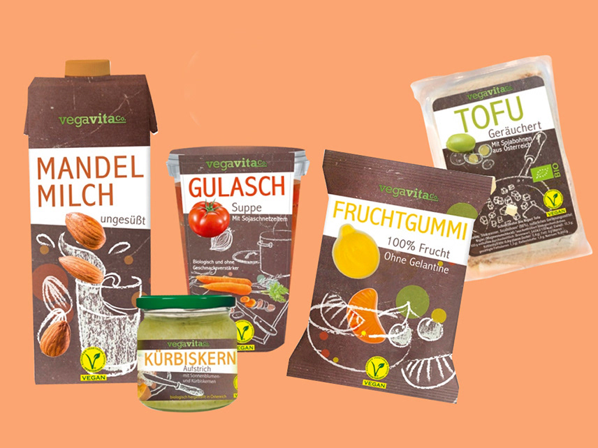
The approachable bird nurtures a lively and open brand character and leads the consumer to a nature related brand. The circular logo shape creates a huge impact on shelf. In addition with the authentic food composing in Background, the whole packaging is approachable and yummy.

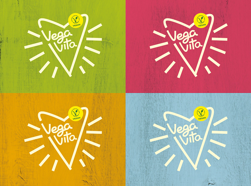
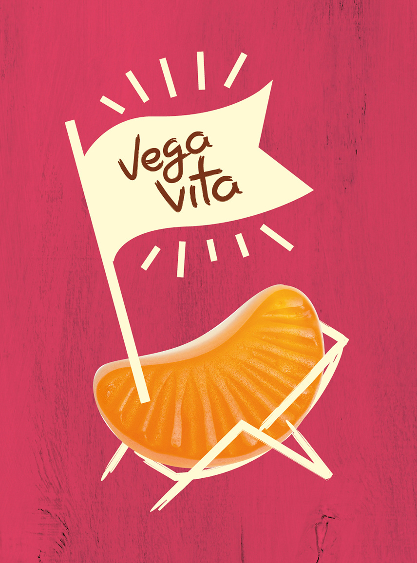
Drafts – I really liked the first heart logo. Even if its a heart, for me it´s not to feminin at all as it creates a really temporary, open hearted look and feel. Like the word ´vita´means life the logo is spreading life. In my opinion this concept nurtures are a vegetarian power or movement.