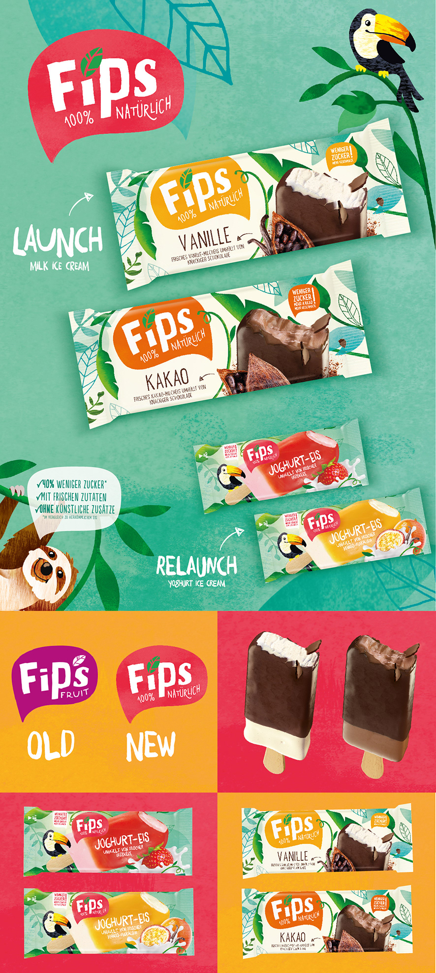
BACKGROUND
Fips Fruit is a young ice cream start up from Hamburg. The product idea started out of the problem, that kids are not provided with healthy and less sugary ice cream in general. Out of this issue, the company developed a water ice followed by a yoghurt ice cream. Due to several issues, the company ask us to relaunch their latest yoghurt packaging as well as create a new more adult driven milk ice cream packaging design.
SOLUTION
With the relaunch we kept all the key elements but created a new more yummy ice cream visual and brought the background in an overall more summery look. We needed to leave the old milk image, due to the clients wish.
The new milk ice cream plays the jungle in a more pattern way to nurture a more quality driven look and feel. The logo is played a lot bigger and surrounded by leaves, wich creates more impact on shelf and hierarchy-wise. The benefit of the product is placed just besides the product, so the consumer directly gets the most important info.
Role: Concept & Design | Agency: own client at helki Studio