Mondamin | Logo Relaunch
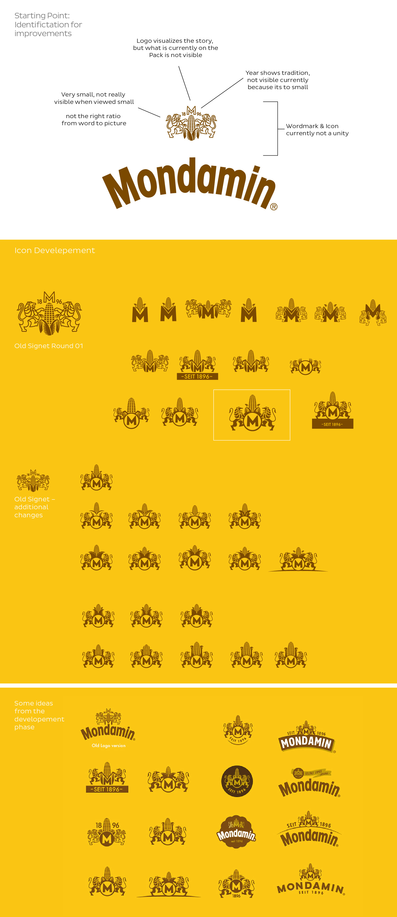
Background | Mondamin is a traditional German Food Brand, founded in 1896. Their portfolio serves mainly binders and convenience desserts. Due to their binder relaunch in 2017, the clients ask about a logo update, what was my task then.
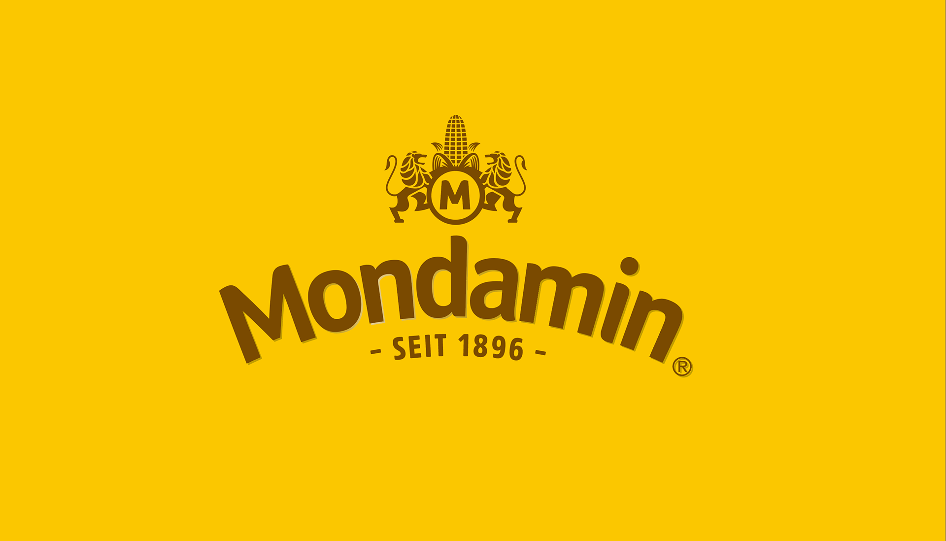
Solution | With the new logo I tried to create a more clean and clear mark. I thought, that especially the icon on top needs a more visible approach. With the new logo ensemble Mondamin is a more quality driven and strong brand.
The icon is really visible and directly related with Mondamin by adding the Mondamin M to it. The icon is now also usable without the big Mondamin typeface, which brings more freedom in usage.
Logo | Freelance Idea, Concept & Design
Agency | BrawandRieken Communications GmbH
Logo | Freelance Idea, Concept & Design
Agency | BrawandRieken Communications GmbH