BACKGROUND
neo is a modern tobacco brand for electronic cigarettes in china. As an addition to their standard tobacco taste range, they wanted Landor to create a new range, with a lighter and more sensorial approach, but also in an artsy way.
SOLUTION
ONLY CONCEPT PHASE (Using Mood-Material from several Artists, all named below)
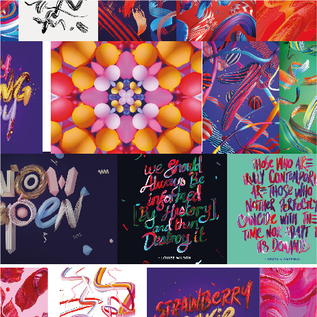
I had half a day to think about this lighter range. Overall I had the idea of transforming the smoke into something digital. I did some research and had some artist back in mind that fitted to my thoughts. What you see here are quick mockups and two line-ups that went into the first presentation with the client. Creative Direction was Landor London, so not all of the concepts I loved came one step further.
Role: Concept and Design, Freelance | Agency: Landor Hamburg, Paris, London
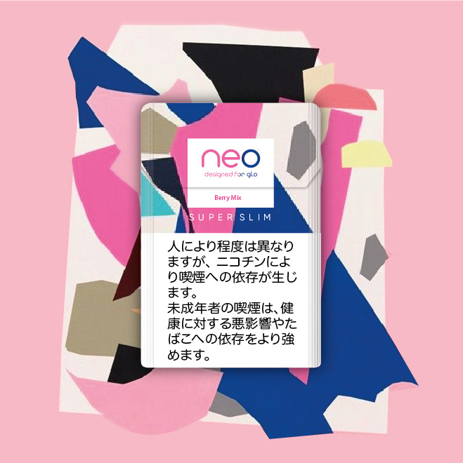
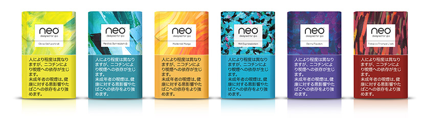
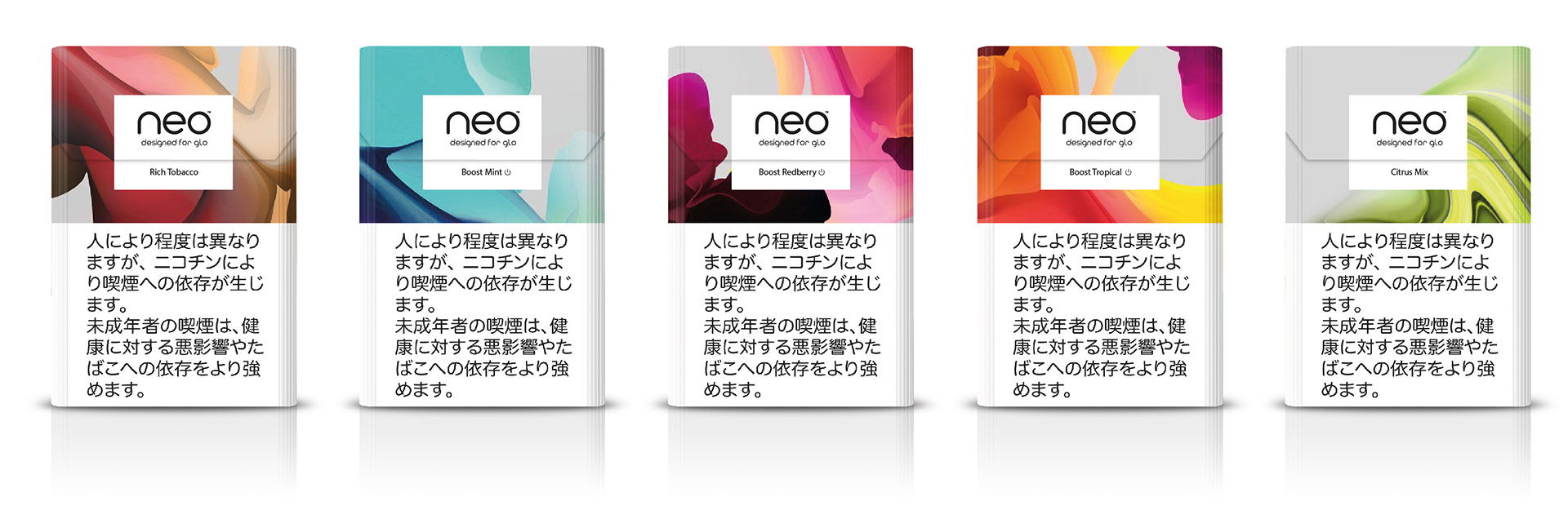
This is the CURRENT range for the full taste.
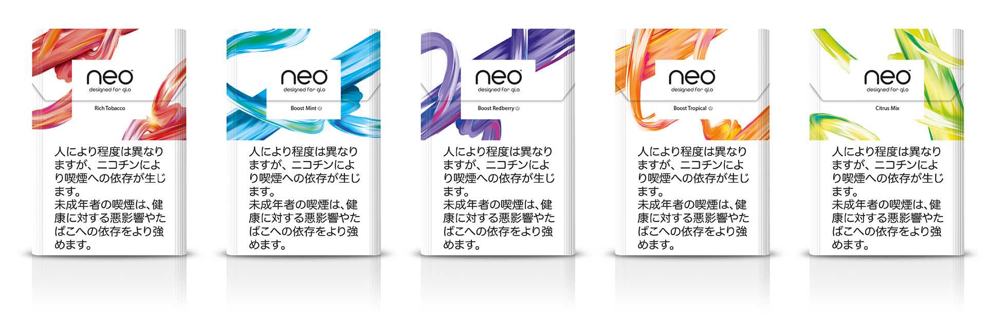
Step one For step one, my goal was to use the current art approach and bring in more lightness and modernity that comes along with the new range. So my Idea was to have a white pack which nurtures the slimline character als well as differentiate with the brand approach a bit (this is just an extract of the designs).


Step two For step two, I had this vision of modern sensorial art.
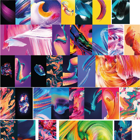
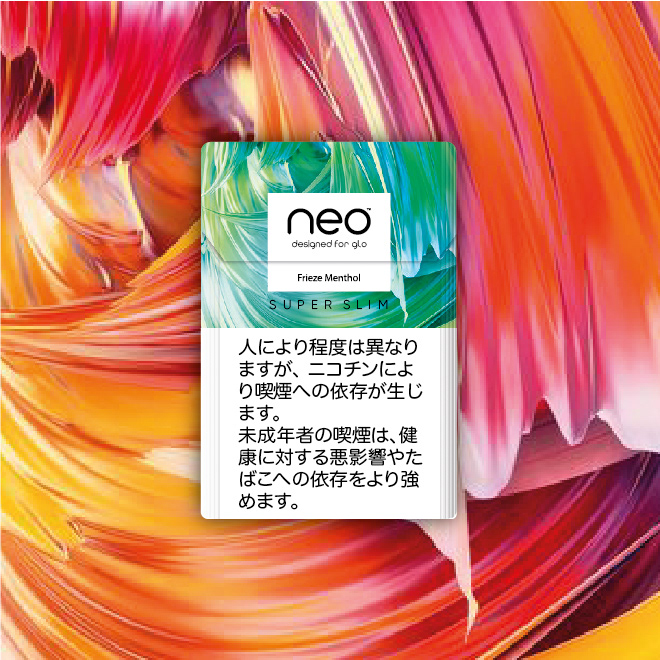
Route 01A is about DIGITAL PAINTINGS like the ones from Artist Velvet Spectrum felt great for this approach.


Route 01B is also about this diverse modern painting style. In comparison to the current range it dives more into the

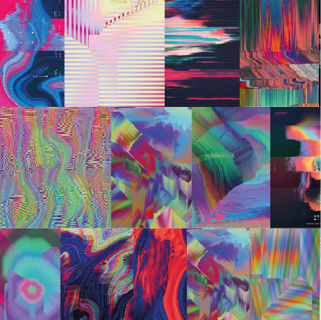
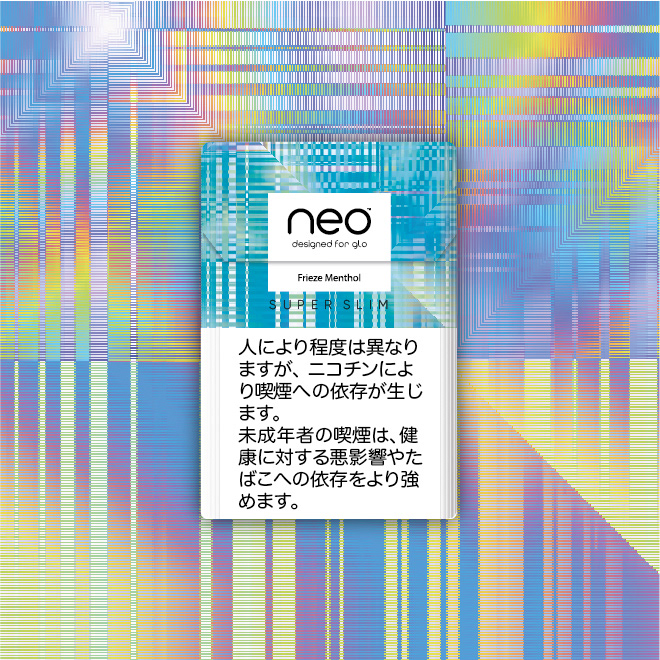
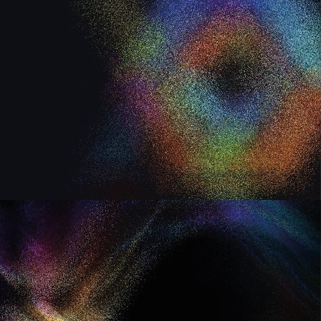
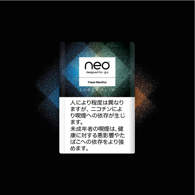
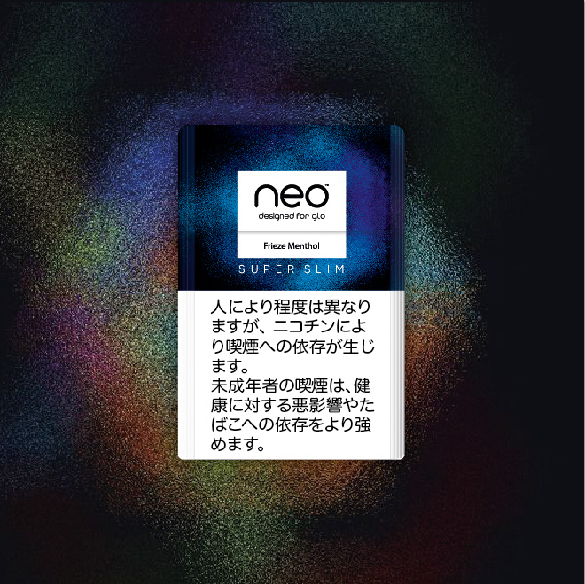
Route 02 was about PIXELS. I see smoke in this Digital Smoke transformation and think its a beautiful way of playing this on pack – especially with a beautiful material.
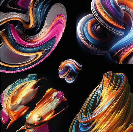
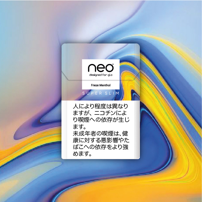
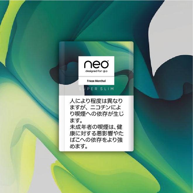
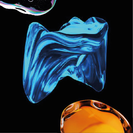
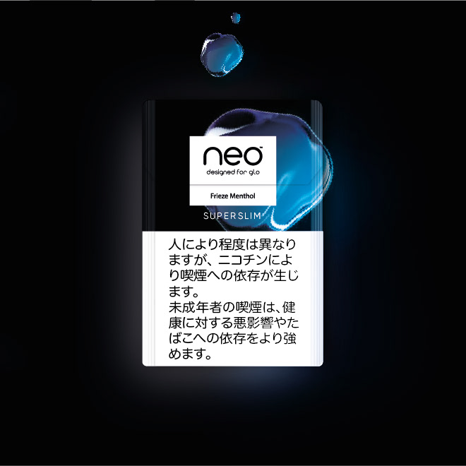
Route 03 is also in spired by an Artist I med several years ago. DIGITAL FLUIDITY Rik Oostenbroek for me felt dynamic, diverse, deep and fascinating, like the taste of the new range.

Route 04 is more about the smoke in its softness and depth.

Route 04 This Route is about the BEAUTY OF SMOKE The more drop like reduced visual should transfer ´Captured Smoke´.
Route 05 This Route nurtures the SENSORIAL DEPTH the most. I was thinking about an haptical pack here that could bring the also reduced by soft and smooth visuals perfectly to life.
Additional Idea: This Idea was about shifting the current Art Style into a more urban direction. Even it uses harder edges, for me it nurtures more the style of the product and the lifestyle that the target group is looking for.